Watch this 10-minute video for a quick view as global economies start to reopen.
Summary
Despite the gloomy tone struck above, the latest COVID-19 and economic news just might contain more positives than negatives.
Positives:
- The global COVID-19 death rate continues to decline.
- The North American job numbers for April were not quite as bad as feared.
- Analysis of household income data argues that consumer spending may not have to fall as profoundly as initially imagined.
- There is now evidence of a tentative economic revival taking place in some markets.
- We are unconvinced that populism will surge in response to COVID-19.
Negatives:
- The U.S., Canada and U.K. are still not seeing as enthusiastic a decline in new COVID-19 infections as continental Europe.
- We remain quite concerned that some jurisdictions may be re-opening their economies prematurely.
- We remain of the opinion that the economic recovery will be, by necessity, gradual and ultimately incomplete in 2020.
- While far from certain, higher inflation is a possibility over the long run.
Virus developments
The global COVID-19 trend remains familiar, with just under 80,000 new infections per day. The total infected base has now risen to approximately 4 million people (see chart).
Spread of COVID-19 globally
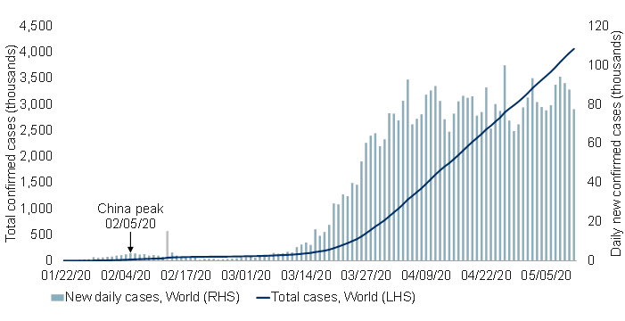
Note: As of 05/11/2020. Spike on 02/13/2020 due to methodology change. Source: ECDC, Macrobond, RBC GAM
That said, as we have detailed in prior #MacroMemos, the raw infection data is probably failing to capture the full extent of the improving situation. The number of COVID-19 deaths provides a more truthful picture, and finds a clearer improvement (see chart).
COVID-19 deaths globally
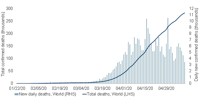
Note: As of 05/11/2020. Spike on 02/13/2020 due to methodology change. Source: ECDC, Macrobond, RBC GAM
Breaking this global figure into its contingent parts, it is evident that the growth rate in COVID-19-related deaths has slowed nearly everywhere (see next chart).
Trajectory of COVID-19 deaths in different countries
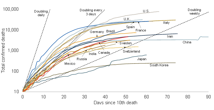
Note: As of 05/11/2020. Dashed lines represent slope at which deaths double every day/3 days/week. Source: ECDC, Macrobond, RBC GAM
Europe remains a good-news story, with few new cases reported in Germany, France and Switzerland. Italy and Spain are slightly further away from eliminating the virus altogether, but both countries have managed sharp declines.
After struggling in recent weeks, the Canadian figures now appear to be improving again, with new cases now running at just over half their peak trend level (see chart). British Columbia has seemingly managed to virtually eradiate the virus, with Alberta also reporting a sharp decline in cases. Ontario’s daily infection rate has fallen moderately, with Quebec down more tentatively.
Spread of COVID-19 in Canada
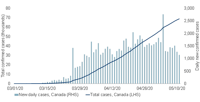
Note: As of 05/11/2020. Source: ECDC, Macrobond, RBC GAM
The U.S. is also managing a slight decline in new infections, with a more material drop in deaths (see the following two charts). At the state level, the experience varies significantly, and is not obviously based on the degree of quarantining. While California and New York have both been strict in their quarantine, California is now suffering a rising trend while New York logs a substantial decline. Meanwhile, Georgia and South Carolina – among the earliest states to restart their economies – have not yet experienced a jump in new cases. It is possible they have implemented a sufficient number of safety measures to manage this restart, though equally one would expect any new outbreak to take a few weeks to appear in the data. The next week could thus prove highly informative.
Spread of COVID-19 in the U.S.
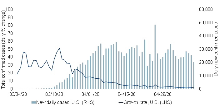
Note: As of 05/11/2020. Source: ECDC, Macrobond, RBC GAM
COVID-19 deaths in the U.S.
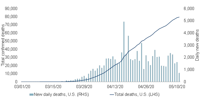
Note: As of 05/11/2020. Source: ECDC, Macrobond, RBC GAM
The U.K. finds itself in a frustrating position in that, according to Google Mobility data, it has now implemented among the most aggressive quarantines and yet is barely seeing a decline in the number of new infections per day.
Among unorthodox countries, Japan is again back to a happily declining infection trend despite never having implemented a quarantine as aggressive as in most developed countries. Sweden has suffered a higher infection rate than many, but is nevertheless recording a declining number of new cases even as it avoids strict quarantine measures.
Some emerging-market countries remain problematic, including Russia and Mexico. But even these countries have recently seen a flattening in their number of new cases.
Slicing the data
We now look at the COVID-19 data using three unique lenses to provide additional insight.
- Infections per capita
First, a discussion about the rising or falling number of new infections fails to convey the relative severity with which each country has been afflicted.
The number of infections per capita captures this idea (see next chart), and highlights that Spain, the U.S. and Italy have been the most widely infected nations, while Japan, China and India have had the smallest share of their population infected.
Impact of COVID-19 on a population adjusted basis
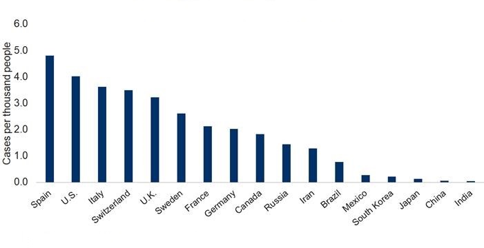
Note: AS of 05/11/2020. Source: ECDC, Macrobond, RBC GAM
Other interesting observations:
- Sweden has – thus far – done better than many others, including the U.S. and U.K.
- Canada has also fared quite well – an important counterpoint given our frustration until recently that the country’s trend wasn’t improving by as much as some others.
- The true infection rate
At the risk of casting a shadow over some of the conclusions reached in the prior section, it is widely acknowledged that the official infection figures fail to capture the full extent of the spread of COVID-19. We are aware of two ways to arrive at an estimate of the true number of infections.
- If one presumes that the great majority of symptomatic COVID-19 cases have been captured by the official estimates, one can estimate the number of asymptomatic cases to reach the true total. However, estimates of the fraction of overall cases that are asymptomatic are so ludicrously varied (we have seen estimates ranging from 1% to 96%) that the true number of cases could be anywhere between 1.01 times and 25 times higher than the official numbers. One of the more recent and possibly more reliable estimates is from New York City. There, anti-body tests argued that nearly 10 times more people had been infected with COVID-19 than the official count.
- Researchers at the University of Montreal developed a formula for estimating the number of true underlying infections in a population based on the rate at which different jurisdictions are testing and the percentage of those tests that come back positive. The idea is that if one place is testing 1% of the population and uncovering a 30% positive rate while another is testing 5% of the population and uncovering a 10% positive rate, one can fit a curve to the mathematical relationship between all of the countries to yield an estimate for what the positive rate would be if 100% of the population were tested. Whereas the original paper was focused on U.S. states, we have repurposed it to look internationally and updated it with fresh inputs. Because of this repurposing, the estimates are especially rough. Loosely speaking, they imply that the U.S., Canada and U.K. might all have three to five times more cases than officially declared.
It is unclear which, if any, of these approaches yields the truest estimate. But if we were to take a fairly cautious middle-ground by assuming that the true infection rate is around four times higher than officially estimated, this still only means that 1.6% of the U.S. has been infected – a far cry from the 60% to 70% necessary to achieve herd immunity.
- The recovered
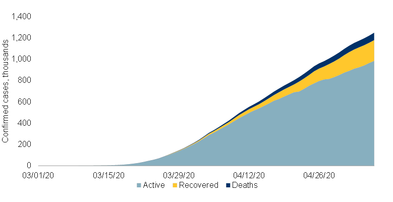
We have been slightly disingenuous when we refer to the number of infections in each country. In fact, the standard figures merely refer to the total number of infections ever reported in a country, not the number of active cases. In China, this distinction makes a world of difference, as virtually all of the country’s original infection spike has since been resolved three months later.
It is obviously useful to track how many people are actively sick, as this says something about the health care burden and also the threat that the virus will continue to circulate. Unfortunately, such data is not reliably available in many countries. Furthermore, it would appear that different nations may be using quite different standards. For example:
- In the U.S., only around 200,000 people are deemed to have recovered – just 15% of the total (see chart below).
- In contrast, Canada reports that around 45% of its infected have since recovered.
The countries have otherwise had fairly similar experiences with COVID-19. This leads to the conclusion that the U.S. must be far stingier in its declaration of good health – rather than that Canadians somehow recover several times faster than do Americans.
Active case curve continues to rise in the U.S.
Note: As of 05/07/2020. Source: The COVID Tracking Project, Macrobond, RBC GAM
For now, this data therefore isn’t of great use, but it may become more helpful as international definitions align and tracking improves.
Economic developments
There are a handful of positive economic developments to share, including employment figures that are atrocious on the surface but nevertheless not quite as bad as feared.
A smattering of the real-time economic data we track is beginning to rebound, as discussed in greater detail later.
It is heartening that Chinese car sales have now rebounded fully, transacting at a rate higher than the equivalent month in the prior year. To the extent Chinese consumer spending had been lagging the broader Chinese economic rebound, this is a good sign. However, let us recognize that there is an artificial component to the revival, as many Chinese households no longer wish to commute via mass transit with infectious diseases now in focus. Even if the developed world feels similarly, this is unlikely to necessitate the same rush to auto showrooms as most developed-world households already possess a motor vehicle.
Canadian employment
The Canadian employment report for April had something of a Dr. Jekyll and Mr. Hyde aspect to it. The happy news was that the job losses were merely half what the consensus forecast had anticipated. The horrific news was that this nevertheless represented the loss of a record two million jobs.
The forecasting miss was largely because forecasters had keyed off of the fact that more than 7.6 million Canadians have applied for income assistance, with the presumption that the majority of them had lost their jobs. It appears instead that over half of such individuals have instead retained their jobs but are now earning less than the $2,000 per month threshold for eligibility.
Canada’s official unemployment rate is now 13%, but after adjusting for people who want work but can’t actually look for it, the true unemployment rate is 18%. Even this underestimates the abruptness of the Canadian deterioration, since – as hinted by the number of Canadians applying for assistance despite technically retaining their jobs – the overall hours worked in Canada has fallen by an incredible 28% cumulatively over the past two months.
Indeed, Statistics Canada reports that 2.5 million Canadians are now working substantially fewer than their usual hours. When combined with the 2 million job loss in April and an earlier 1 million loss in March, that adds up to 5.5 million affected workers – more than a quarter of the labour force, and within spitting distance (though still somewhat short) of the total number of Canadians applying for income assistance.
Providing further insight into the sector-by-sector damage from COVID-19, in March the great bulk of the job losses occurred in the accommodation & food and retail sectors. In April the construction and manufacturing sector played catch-up.
While the sheer number of jobs being eliminated is without precedent, there is reason to think most of the jobs can be reclaimed fairly easily as the economy revives. Fully two-thirds of those now unemployed report an ongoing attachment to a specific job. They have not been cast loose and left to scramble for an entirely new job or even career as was the case during the global financial crisis.
U.S. employment
The U.S. job numbers were less schizophrenic, with the record job loss arriving only slightly better than expectations, at -20 million. Given what we already know about the number of weekly jobless claims since the reference week for April, it seems likely that the May data will reveal a further 10 million or so lost jobs, even with the economy mounting a tentative recovery.
The U.S. unemployment rate rose to 15% in April, the highest level since the 1940s. Properly adjusted for workers unable to search for jobs given the quarantine, the true number is 20%.
While the raw unemployment number is higher than Canada’s equivalent figure, the hours worked data tells a different tale: U.S. hours worked is down 16% versus a 28% decline in Canada. Thus, the U.S. has not been hit quite as badly as it first looks relative to others. Instead, what is on display is the greater flexibility of the U.S. labour market that results in a greater fraction of layoffs while other countries focus more on reducing the hours of existing workers.
Estimating consumer spending
As we grapple with the enormity of the economic damage being done by COVID-19, it is all too easy to be overwhelmed by giant numbers like 20 million lost jobs or a reported 36% decline in U.S. business revenues. But it is still useful to delve into the details and to engage in different thought experiments.
One such exercise yields a surprising finding. When we take the sharp decline in hours worked reported for the U.S. and Canada (-16% and -28%, respectively), it is tempting to conclude that consumer spending should be down by a similar amount. We have used that shorthand ourselves on occasion.
But the true impact on consumer spending may actually be considerably less. Four adjustments are necessary to reach this view. One is negative, but three are positive.
The negative adjustment is that households invariably save more during economic shocks. This was even true during the Great Depression, when the U.S. personal savings rate soared from 5% to 25%. This pattern might seem counter-intuitive, as one immediately thinks of the newly unemployed workers who have flipped from saving to dissaving. However, the majority of workers who retain their jobs invariably opt to save more when confronted with uncertainty about the future and, in this specific instance, are prevented from going on vacation or heading to the shopping mall.
This latter behavior proves to be the dominant force. In the U.S., the personal savings rate had already risen from 8% in February to 13% in March, and is almost certain to have been higher yet in April. China has similarly reported a higher savings rate. In the context of consumer spending, then, spending should thus fall more abruptly than income.
However, three positive adjustments are also necessary.
- The workers who have been laid off tended to earn below-average wages. This can be seen in the fact that big wage increases were reported in the latest employment reports. Few employers would actually be announcing generous wage hikes at a time such as this – it is instead a compositional effect as lower-paid workers lose their jobs. All of this means that labour income has not fallen by as much as hours worked.
- Households earn income from more than just labour. The other sources tend to be smaller, but they are not negligible. Furthermore, the other sources have likely not shrunk to the same extent, be they government assistance, pension income or investment income.
- Governments are now deploying massive stimulus programs, with a considerable fraction of the funds directed at individuals. The very purpose of these programs is to fill the large hole in personal incomes created by COVID-19.
When we make reasonable, if rough-hewn, approximations for all of the factors discussed above, it is possible that the average household income in the U.S. and Canada has barely dimmed. One still reaches the conclusion that overall consumer spending should fall when the higher savings rate is taken into account, but not obviously by much more than 10%. This is a far cry from the 25% to 30% decline in consumer spending we assumed in our expenditure-based GDP estimates last week.
To be clear, this is just one technique for estimating the likely extent of the economic damage imposed by COVID-19. It is tentatively supported by Redbook retail sales data, which argue that while department and specialty store sales are down 48%, the Redbook proxy for overall retail sales may only have declined by 9% due to greater spending at discount stores.
However, there are other less optimistic assessments out there. The official retail sales data in March fell by 7.5% even though the quarantine only took effect over the final third of the month. It doesn’t take a huge leap to extrapolate that the drop in April might be 15%, 20%, or even slightly worse. And scraps of evidence we can find about real-time credit card usage continue to make the case for a 30%-plus decline in consumer spending (though non-discretionary spending is underrepresented in such measures).
Furthermore, it is hard to reconcile such findings with surveys indicating that business revenues are down by 36% in the U.S. If consumer spending has ultimately fallen by less than this, it either indicates some flaw in the methodology or that the business investment component of GDP has tumbled by more than we had assumed. This is far from impossible to the extent that business investment is historically more volatile than consumer spending.
For that matter, a survey of U.S. businesses finds that they have reduced private-sector hours by at least 35% – more than double the official decline in hours worked. Is this hyperbole? Are there compositional issues in the survey? Might it be that the official statistics are distorted by underreporting during a crisis? It is hard to say.
The bottom line is that a new methodology presents the possibility that consumer spending could hold up better than previously imagined. But there are still a variety of other approaches that continue to point to enormous economic damage, and it seems unwise to discard these altogether.
Reviewing forecasts
A variety of prominent institutions have published new economic forecasts. It is worth reviewing these to determine whether the pattern of downward revisions has ceased, and to compare the new numbers to the official consensus.
For each of the Eurozone, the U.K. and Canada, a quasi-official institution has proffered a new forecast, and this forecast has landed below the consensus. This is consistent with our own positioning below the consensus.
Eurozone growth
The European Commission has updated its growth forecast for the Eurozone, subtracting three percentage points from its 2020 outlook. It now anticipates a 7.7% decline in Eurozone GDP, moderately worse than the consensus. We are on the same side of the consensus, though with a materially worse forecast of -15.0%.
U.K. growth
The Bank of England has now published its forecast for the U.K. economy. It is a grim set of figures. The BoE says that this will be the deepest recession in more than 300 years, with output set to fall by 30% over the first half of the year. Household consumption is expected to decline by 30% (recall our discussion, above, on consumption – the BoE clearly assumes the worst) and business investment is expected to drop by 50%. Over the entirety of 2020, GDP is expected to decline by 14%. This is very similar to our own forecast of -15.3%. Both are massively below the Bloomberg consensus of -6.1%.
Canadian growth
Canada’s Parliamentary Budget Office has now come out with its own economic scenarios, with a 12% decline in GDP assumed for 2020. This is in line with our own forecast of -12.7%, and also a great deal below the Bloomberg consensus of -5.4%.
To be sure, the fact that other prominent forecasters sport similar forecasts provides no guarantees that we are right. There are plenty of smart private-sector forecasters with much milder estimates. But we derive some solace that many of the best resourced forecasters with the most sophisticated models are landing on the same side of the consensus. What is more, these entities are traditionally quite conservative, and so it says something about their level of conviction when they leap so far from the security of the consensus.
Awakenings
A wide variety of countries and jurisdictions continue to incrementally ease their restrictions on daily life.
While we have not yet witnessed a significant uptick in conventional economic data outside of China, unconventional real-time data offers a few tantalizing clues.
Apple Mobility data for Georgia – among the most enthusiastic of the U.S. states to re-open – has rebounded substantially. Whereas driving had been down 60% in the state, it is now down just 8% relative to normal. To be fair, this isn’t mapping one-for-one onto economic activity. Google Mobility data shows that while Georgians are visiting more retail stores, this has only recovered from -40% versus normal to -23%. Hours worked data has now recovered almost a quarter of what it had lost. These are all significant gains, though also leave a significant margin for further improvement.
It was eye-opening that Shanghai Disneyland has now announced its re-opening. We had assumed that tourist attractions would be among the last to recommence. In fairness, so much of China has restarted that perhaps this is indeed among the last to receive formal approval, and it should be noted that social distancing rules still apply.
But for all of this tentative good news, let us not forget that any recovery is likely to be both gradual and ultimately incomplete for the many reasons articulated in the following table:
Sluggish economic rebound

As of May 2020. Source: RBC GAM
Second wave?
We remain nervous about the enthusiasm with which some economies are opting to re-open. One way of thinking about this is that COVID-19 appears to have a natural transmission rate of around three, meaning that, absent special measures, each sick person can expect to infect three others. The disease thus spreads very quickly. The world’s heroic efforts over the past three months have only managed to reduce the global transmission rate to right around one – a level consistent with the steady (no longer accelerating) spread of the virus over time. The number has to be below one to reduce the number of new infections over time, eventually taming the disease altogether (see next chart).
Global transmission rate hovering around key threshold of one
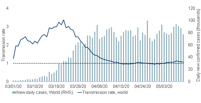
Note: As of 05/11/2020. Transmission rate calculated as 7-day % change of underlying 5-day moving average of new daily cases. Source: ECDC, Macrobond, RBC GAM
Of course, the story varies significantly by region. Several countries, including Italy and Spain, appear to be in a fairly good position to ease the extent of their social distancing efforts because their own national transmission rates are now notably below one (see next chart).
Transmission rate above one suggests continued growth (based on new charts)
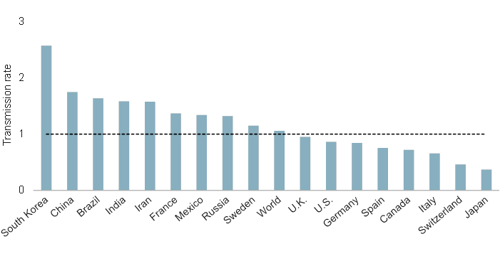
Note: As of 05/11/2020. Transmission rate calculated as 7-day % change of underlying 5-day moving average of new daily cases.
Crucially, the extent to which each region can ease its restrictions depends on how far below one the transmission rate is. Italy and Spain can moderately ease its quarantine, whereas the U.S. may prove capable of only a tiny alleviation. To the extent that Italy and Spain have transmission rates of around 0.7 and the natural state is three, even they can really only afford to lift 13% of their social distancing measures before the transmission rate will be back above one and creating problems anew.
For U.S. states that never managed to get their transmission rate sustainable below one, the obvious risk is that their economic restart will result in a transmission rate notably above one and an accelerating number of new cases. This, in turn, could necessitate a second economic shutdown (or such regions might opt to hold their noses and pursue herd immunity at a considerable cost of human lives).
But let us not pretend that we have all of the answers. Sweden’s social distancing has been less intense than many others. Its traffic congestion levels are nearly normal for the afternoon commute, whereas other European countries report only one quarter of the normal pressures. Yet Sweden is tentatively managing fewer new cases.
One might argue that China is already going through its own double-dip experience, though in a different fashion. After substantially reviving its own economy, China is now grappling with feeble foreign demand. Possibly related to this, the Financial Times China economic activity index has again retreated since the middle of April.
Solvency damage
As we track the extent of economic damage, we keep a special eye out for evidence of companies or households encountering solvency challenges. These can have cascading consequences and their effects can be long-lasting.
Fortunately, policymakers have focused aggressively on this risk, providing sufficient liquidity to ensure that those with relatively straight-forward liquidity problems do not morph into solvency problems. They have also provided forgivable loans and direct transfers to the household and businesses that might genuinely be flirting with insolvency.
Nevertheless, a trickle of insolvency problems have now emerged. Already enfeebled retailers such as Neiman Marcus and J. Crew have now filed for bankruptcy protection in the U.S. and shoe chain Aldo has similarly filed for creditor protection in Canada. It will be worth watching this space to determine the extent to which this becomes a serious problem.
In the household space, Canada’s latest employment report contained a special question probing the extent to which Canadians are struggling to meet their financial obligations. On the surface, the picture is not pretty. Fully 21% of Canadians now report such difficulties, raising the spectre of personal bankruptcies, mortgage foreclosures, and so on. However, a closer inspection yields a slightly less alarming conclusion. This is approximately the same figure as in 2018 when this question was last asked. In other words, a significant fraction of Canadian households are struggling, but it was a similar story two years ago and nothing cataclysmic happened over the subsequent years.
It is notable that while Google searches for “bankruptcy” and “foreclosure” have risen in recent months, they remain much tamer than during the global financial crisis (see next two charts).
Google searches for “bankruptcy” and “foreclosure” in distressed times: Canada
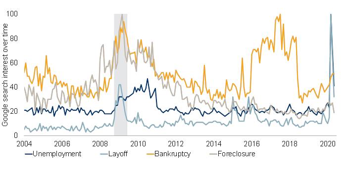
Note: As of May 2020 (partial data used for the month). The number of Google web searches for the topic relative to the total number of searches on Google over time is scaled and normalized to arrive at the search interest over time. Shaded area represents recessions. Source: Google Trends, Haver Analytics, RBC GAM
Google searches for “bankruptcy” and “foreclosure” in distressed times: U.S.
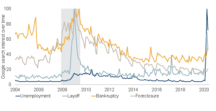
Note: As of May 2020 (partial data used for the month). The number of Google web searches for the topic relative to the total number of searches on Google over time is scaled and normalized to arrive at the search interest over time. Shaded area represents recessions. Source: Google Trends, Haver Analytics, RBC GAM
Populism?
We’ve noted in the past that the effects of COVID-19 on populism are hard to nail down.
It is undeniable that moments of crisis tend to induce a rush toward populist politicians, as occurred in the decade after the global financial crisis. Indeed, a study of German regions found that those most damaged by the Spanish Flu were the most likely to vote for extremist parties more than a decade later.
Similarly, one can imagine that the anti-globalization trend will only accelerate from here given bickering between the U.S. and China; with the prospect of reduced international travel; and given an increased focus on national security via on-shoring, not just of military components and food, but also of medical devices and perhaps a range of other objects.
But there is a flip side to the argument. Scientists, doctors and public policy experts are taking leading roles in navigating through COVID-19. To the extent public approval is high for the effort taken so far, that could create an appetite for technocratic leaders – the very opposite of populism.
We are not ultimately convinced that the political leaning of politicians over the coming decade will necessarily be much different than before. It is undeniable that globalization will take a further step backward and that this is traditionally associated with populism, but the reason in this case has little to do with trade being inherently “bad”, and entirely to do with getting countries into a better position to withstand future pandemics, plus what could be a lingering suspicion of travel by ordinary people. Perhaps the consequences are similar – a bit more inflation and a bit less growth – but the underpinnings are not.
Instead, the most useful political framework to pay attention to may be that incumbents are enjoying surging popularity. Whereas wars are no longer the catalyst they once were for populations to rally around their leaders, it would appear that pandemics still are.
To be sure, there are prominent exceptions: President Trump has, if anything, suffered a slight diminishment of popularity; Japanese Prime Minister Abe and Brazilian President Bolsonaro have also slipped.
But many leaders are enjoying record polling. Australia’s prime minister has now managed a nearly 30 percentage point rise in popularity. Canada’s Trudeau is up nearly 25%, Germany’s Merkel is up almost 20%, the U.K.’s Johnson is up roughly 15%, India’s Modi is up more than 10% and France’s Macron has risen by more than 5%.1 There isn’t a huge amount of commonality across these politicians other than that they are all incumbents. And they are all now more likely to remain in office for longer.
Inflation debate
In the debate over whether inflation will eventually go up or down in response to COVID-19, the short-term answer is clearly down. Market-based inflation expectations have fallen, the consensus for April inflation prints is sharply lower and real-time inflation measures have fallen.
The observation that some foodstuffs and household equipment have become more expensive appears to be genuine based on real-time price data. But this is more than offset by lower inflation in a variety of other areas, none more prominent than energy costs that have plummeted.
Turning from the short term to the long run, the debate is much more challenging. There remain valid arguments on both sides of the ledger, as highlighted in the following graphic. At a minimum, the level of inflation uncertainty is now unusually high.
COVID-19: Deflation in the short run, but less clear in the long run

As of May 2020. Source: RBC GAM
While we are far from convinced that quantitative easing will turn into inflation, it is fair to concede that any inflation that might normally have arisen from the financial-crisis era bout of quantitative easing may have been masked by structurally deleveraging banks. There is no symmetrical offset this time.
It would be foolish for governments to attempt to inflate away their debt in any significant way, but it is not impossible that diminished central bank independence might allow a smidgen of extra inflation to worm its way into the equation and nibble away at the debt load.
Meanwhile, the huge COVID-19 demand shock will eventually fade and oil prices won’t fall forever – in both cases, this argues for an eventual normalization of inflation.
Thus, in a decade’s time, one is left with what is almost certain to be a large public debt load, quite possibly still a big central bank balance sheet and an altered supply chain, all pitted against long-standing structural depressants such as adverse demographics. The conclusion is far from clear, but one might well imagine the bond market eventually opting to price in an additional risk premium.
-With contributions from Vivien Lee and Graeme Saunders
Interested in more insights from Eric Lascelles and other RBC GAM thought leaders? Read more insights now.